Friday, February 20, 2009

Heavy Reading, Hard Sketches, Light Grenades

I hate the fact that I'm more or less late with this new entry, but what can I do? I just got to set up a better way to do this on a weekly basis from here on out, like I said I was going to... Like writing these weekly entries on a daily basis.

As I said about a week ago, this entry has a lot more reading as opposed to artwork. It's all talk about projects for class and pet projects I've been working on as of late, so there may not be as many pictures to show this time around. Just so you're warned.

Class Projects

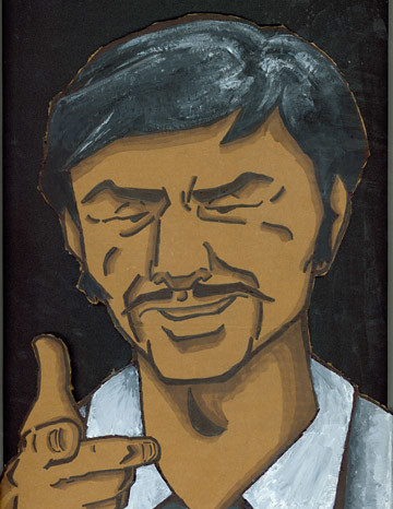
Since the beginning of junior year in my Illustration III class and up until about a week ago we were working on a project simply entitled "Clock". For this assignment we had to design our own clock face that showed or represented time and that it had to be pleasant to look at. We just finished this assignment about two weeks ago and here's the end result.


I'm personally pretty proud of it, especially since it's an acrylic painting and I haven't done that in a very long time. As for how it met up to the assignment's expectations, it worked and met the requirements but Professor Wojech Wolinksi suggested that I should work more in tones from here on on out as opposed to just using a variety of different colors. Which is something I just recently started doing in my Word and Image class for the current assignment that we're working on.

We're currently doing a new project, a semester long body of work called "Horse" and we're working on the first part of it. Which consists of doing a study of a part of the horse. For a while, I wasn't sure what to do for this assignment since I originally wanted to do a study of the horse's legs but I ended up doing a study of the head since it was going to be a challenge and it would end up being a lot more fun for me to do. I don't have anything to show for it as of yet, but I will have something to show in the next update.

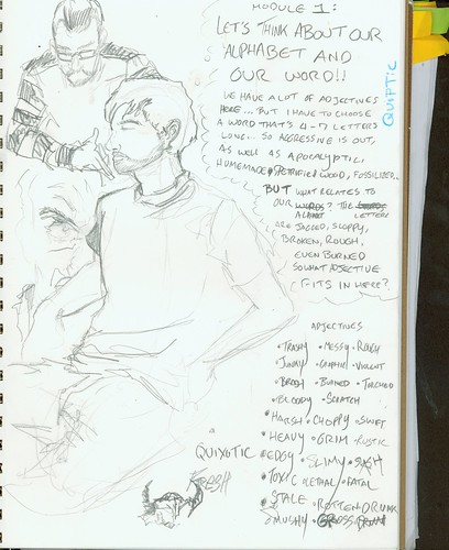
Since I mentioned Word and Image in the previous paragraph, let's discuss that next. For the first assignment we created our own font based off our own handwriting made from experimenting with different handwriting tools and techniques, made an alphabet and named the font based on adjectives we could associate with the font, which ended in creating my font "Brash Bronson" and was then used in a second part of the assignment that involved finding a word that could be used to describe our font and associate a scene or imagery to go with it on the inside of the text. The second part of this project is currently in Suzanne Barnes' possession and I didn't take a photograph of the work before turning it into her. But I can show the font I made, which is right below:


Ain't it DANDY?

In the new project that we're working on, we had a choice of the names "Jim, Jimmy, James" or "Liz, Betty, Elizabeth" and find fonts that associated with these names and create three characters that could be associated with the fonts as well as their names. I ended up picking Liz, Betty and Elizabeth for this project and decided to base the idea of the characters around girls who think that they're people they aren't.


In Liz's case, she thinks she's a Victorian Helena Bonham Carter-type character with homicidal tendencies, Betty thinks she's a robot and Elizabeth thinks she's the Virgin Mary. The sketches and color studies that you see here are preliminary designs for the final piece but the colors seen here will be used in the final versions of the artwork, but the images will be reworked so that the text takes up fifty-percent of the compostion. I've actually been having a blast with this project and I think I might use the Betty character in a little series of mini-comics about her character.

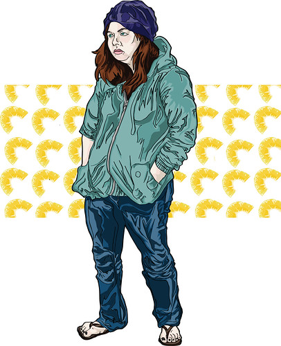
As for my final class, Degree Project with Professor Linda Bourke, I finally decided that my project is going to be about homelessness and I've mostly been doing research and sketching for the project. I don't really have much to say about it currently... Hopefully by next week I should have more to say.

Personal Projects

As for my personal projects, I decided to make another cardboard cutout much like the orchid in the flower pot. This time around I made Gerber Daises, which I gave to a friend of mine as a gift. I decided to use color in this cut out once more to get a better handle on working with acrylic paint on cardboard and as a experiment as well.


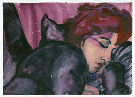
I've also been working on a painting based off of a photograph that I took of my girlfriend and my roommate who is taking a break this semester. I just got started on this a few days ago, so it's at a very early stage currently and I don't plan on painting the picture as if it's the photograph itself, so it'll probably turn out pretty good.

I've also been working on a comic book project for Mass Art In Print and a poster for the club itself to help promote it. The comic is about friends becoming more than just friends and two people on both sides of the idea, one who wants to be more than friends and the other wants to their friends to simply be just friends.

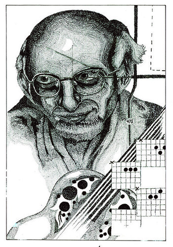
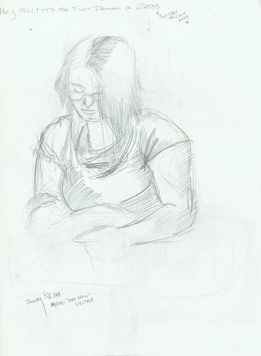
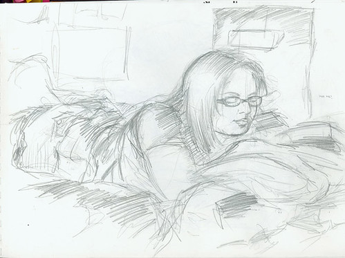
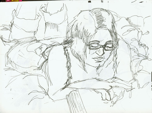
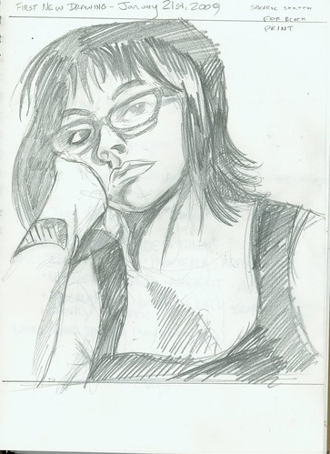
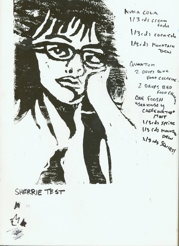
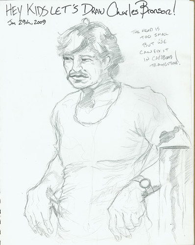
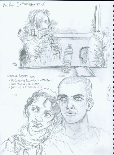
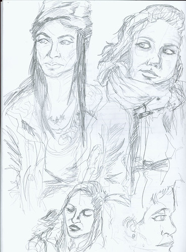
I have sketches from my sketchbooks as well, give them a good look.


That's it for now and next time I'll have an update that's ACTUALLY on time.

Tuesday, February 17, 2009

Light Reading

Unfortunately, I was a bit on the late side with getting the new entry up this weekend. I unfortunately didn't plan my weekend out accordingly since my girlfriend came from New Hampshire to visit and I had to work all weekend. I'm starting to think that it might be wise to start scanning in everything I finish on a daily basis and keeping a draft post until I need to post it on Friday or Saturday.

Artwork is going to be on the light side for this post and I do have a lot to discuss about upcoming projects, but I'll keep my mouth shut until the next entry needs to be posted and just give you the goods.


These are the best sketches from two different sketch books I've been keeping. One is my Word and Image sketchbook (the top) and the bottom is the sketch book I have to keep for my major since they're doing a new sketchbook project to encourage (or force, depending on how you look at it) more sketchbook use. I need to work more with backgrounds, so I'm thinking of just focusing on scenery in my sketchbooks over human figure study as of this moment. I'll have to find a way to balance the two effectively.


These two prints are Linoleum Block Prints of my friend Sherrie and is the first in a series of several portraits of personal friends of mine. There are actually four different colored prints of this image but the blue and black were the only good ones worth showing here. The rest are all archival work now. I actually just got started on sketching my girlfriend for the next block print and I should have that carved and ready to print very soon.


All of these right here is process work for my new project in Word and Image. The entire point of the assignment is to find fonts that associate with characters created from either Jim, Jimmy or James or Liz, Betty or Elizabeth. I chose the latter and decided to create women who were mentally disturbed but sexy. (Sexy girls seems to be a common theme in every class I've been in that Suzanne Barnes taught... Weird.) To give you a quick idea of who is who, Liz is an elegant Helena Bonham Carter-esque psychopath, Elizabeth is a model who thinks she's either a saint or the Virgin Mary and Betty is a girl who thinks she's a robot and would most likely be some kind of camera whore on Myspace. I'm actually having a lot of fun with this assignment since I'm forced to think about creative font placement and designing these characters who I may or may not rename and use in other assignments. (Betty especially, I could see myself doing a comic about a faux-robo girl's dating experiences.) But more on that as the next update comes along.

And now, to leave you on a cute note... Another cardboard cut out work, this time of an Orchid for my girlfriend for Valentine's Day. It's a simple work, but cardboard cutouts should be just that in my opinion. Simple!


Tune in for the next entry since it's later this week and it'll feature a good deal more work, more talk about upcoming projects and heavier reading equipped with light grenades!

Monday, February 9, 2009

2008: The Best! & Original Pirate Material 2009


Hello there and welcome to my new art blog!

I plan on putting up a lot of artwork here ranging from drawings, paintings, screenprints, photographs, assignments from my major and whatever else I feel like putting up here. Like thoughts, cool stuff that's happening and plenty of other stuff. All on a weekly basis!

To start, let's take a look at what I consider my best work from 2008. (Mind you this will probably get updated when I find more things from my previous sketchbooks and assignments which are currently hanging out in my studio, so I'll probably put up a quick notice every time it's updated. This will probably only happen once, so it's not a big deal.)


Kait_Sleeping

This was one of my first paintings of 2008 and was made shortly after Christmas as a painting practice after I got a mid-semester review. It's of my friend Kaitlin, who really liked it a lot.


fruit still life

This was a painting I did for my Illustration I class at the beginning of last year. It was a practice in painting with acrylic and I was pretty pleased with the way it came out. Not necessarily pleased as punch, but pleased none the less.

laura

This right here is a portrait of my friend Laura for my Digital Illustration class and is quite possibly the best thing I've made on a computer, considering that I'm really not that good at making art at the computer. It's my triumph!

Warhol_Brenton

This was made shortly before school ended and it was my first experiment with silkscreen on paper. It was more of an experiment than anything else, but I still love it.

Black_Hole_Kate

A present that I made for my girlfriend over the summer that I want to make something more of. The original idea was to use girls, comic art and song lyrics (or rather reference to, if you can figure this out you're pretty cool.) and make these neat pop-art style comic panels like this. I didn't do much else, but I plan on revisiting this concept very soon.


B+W Editorial

This is my second assignment, Editorial, in my Black and White Illustration class. Unfortunately, this isn't the revised version, but I'll be sure to fix that in the next update when I put up new work and update this section as well.

rainaandtherat

This is another piece from Black and White, "Children's Book" which features a character named Raina (who is based off of my girlfriend, who you'll see in a moment), her robust cat Deliah and a rather wicked rat. The point of this assignment was to work exclusively with a pen nib and detail with cross hatching.

Father_Stipple
Hands down the best art piece I made in 2008 and it's another black and white assignment, Stipple Portrait, where we were supposed to do a portrait of someone who was important to us. My father had suffered a heart attack shortly before when this was assigned (he's alright now) and since he's so important to me, I decided he would be the subject of the piece. We had to incorporate three aspects of him into the work, so I used a roadmap of his hometown Aurora, Colorado, an Ovation acoustic guitar and three chords. It's currently hanging up in my studio at Mass Art.

If I missed anything that you think should be in here, please let me know so I can add it in.

Now let's move along to the newer things that I'm currently doing for the new year and the new semester, ranging from assignments to personal projects and of course, sketches... Which you'll probably see again depending on whether or not I like them enough to do more with it.

The next four sketches are all of my girlfriend when she was visiting me over the winter break.

Gillian_01

Gillian_02

Gillian_03

Gillian_04

This was drawn about a week before school started again, I was riding the sixty-six from Harvard and was just sketching people all over the bus. For some reason this guy struck me as interesting so I sketched him, I'm thinking about doing a much bigger piece with this sketch as well as what's written beneath the sketch itself.

The_World_Is_Yours
The only good sketch I got out of a party that my Gamestop threw at my manager's apartment.

Party_Boys

The next two are a sketch of my friend Sherrie and a test print of a lino-block of her. It's the first part of a several part series of portraits of good friends of mine. When I get the actual print up, it'll look much better than this.

Sherrie_Sketch

Sherrie_Print_Test

Unlike last semester, I actually have time for myself. So now I can ACTUALLY make my own stuff and have personal projects, so naturally one of my first projects was to make a cardboard cut out ala Alex Carlson.

Last semester I wanted to make Altair from Assassian's Creed and I still will, but I found it a bit more pressing to make a Charles Bronson cardboard cut out.

Bronson_Sketch

Originally, I was going to do a much more serious version of Bronson, but then I figured "Let's have some fun with this." and I was watching a LOT of Adult Swim at the time (Sealab 2021 especially) so I decided to make a cartoony version of Bronson.

Bronson_Cardboard

Then I painted him...

BRONSON_FInished

And then I posted him up on the 9th floor over by the refrigerator, asking if he can have some of the unmarked food in the fridge.

IMG_2231

These are sketches from the first day of degree project one with Linda Bourke. I really like these sketches and I think I'm gonna do something with the drawing on the first page. Maybe a screen print or something, I'm definitely going to refine this one.

Degree_Sketchbook_Sketches

Degree_Sketchbook_Sketches_2

Just some stuff I was doodling in my sketchbook during Word and Image with Suzanne Barnes... I also write a LOT in my sketchbooks too.

09

I reckon that this is off to a good start for now. I'll be doing another post this coming week, so stay tuned, watch the skies, same bat-time, same bat-channel, etc.